Monday 17 November 2014

CRAFT SHOW + FREE FONTS!

This Saturday, I will be selling my art at a craft show for the very first time!! I'm excited!


Two of my friends are also selling stuff! One friend is selling Jacaranda products! If you've never heard of Jacaranda Creations, you should definitely check it out! All the products are hand-sewn by women in Africa, and all the money made is sent right back to those women and their families. Learn more by visiting www.jacarandacommunity.com.

My other friend creates amazing and beautiful shadow boxes! She will be opening an Etsy shop very soon, and when she does, I will pass along the link! In the meantime, if you are in the GTA, I hope you can come by and visit our tables at the show!

Here's a sneak peak at some of the stuff I will be selling...


For more information, visit the JKCS Christmas craft show facebook page! www.facebook.com/events/1542755012609786.

And now... FREE FONTS!

The three beautiful fonts that I used in my latest invitation design were absolutely free! And I thought it would be fun to share these with you!


Click on the links below to download the fonts! :)

Enjoy!


Alison


P.S. Check back soon! I will be posting pictures from the craft show!!

Monday 20 October 2014

PIGS ON A BUS IS OFFICIALLY PUBLISHED!!


Our brand new children's book, Pigs On A Bus, has just been released this month!

If you're new to the blog, let me share a little background: Pigs On A Bus is a story that my fiance, Jonathan Harder, came up with one day just for fun. I loved it so much that I illustrated it as a surprise for his birthday, and then we decided to get it published!

Our book is already available on Amazon.ca, Amazon.com and Barnes&Noble! We have also heard that it will soon be on Chapters/Indigo! We are so excited!

Be sure to visit www.pigsonabus.ca to see a sneak preview of the book, and more!

I've already been planning what will be in my next post, and I think you'll like it! So check back soon! :)


Alison

Tuesday 2 September 2014

LIMES & DAISIES GRAND OPENING!


At last, my new wedding website, Limes & Daisies, is officially open for business! You can visit it at www.limesanddaisies.webs.com!

Wedding stationery – either pre-designed, or custom-made from scratch – and custom polymer clay cake toppers are the main products that I am offering. There are already a few invitation designs to choose from, and a brand new design is also in progress!


I keep all of my prices as reasonable as possible so couples can enjoy this special time in their lives, rather than fretting about expenses! In fact, to celebrate the launch of my new site, I am offering 20% off all stationery orders until October 31, 2014!


I also plan to eventually include some DIY centrepiece tutorials and other fun ideas for weddings on a budget. I would also like to be able to recommend other great wedding services, such as photographers, dress shops or caterers. If you offer any of these wedding services, I would be happy to support you by providing a link from my website to yours! Just send an email to alistrations@gmail.com and let me know. :)

So what do you think of Limes & Daisies? Is it user-friendly? Are the fonts legible? Please let me know your thoughts!

Thanks so much!!


Alison

Tuesday 26 August 2014

ART WITH A PURPOSE

This past Saturday, my church hosted a new event called “Art With A Purpose.” It was a sort of “talent show” for anyone in our church who wanted to share the gifts God has given them – whether it was through visual art, music, or other creative outlet. I was so excited to be given a booth to showcase my art!


DISCLAIMER OF SORTS: Please forgive all the “fuzzy” photos in this post! (They were all taken with my phone, and not always in the best lighting conditions!)

I have never done an art show before, but I have assisted someone else with preparing for a trade show, and, of course, I had my trusty friend, Pinterest, there for inspiration. I knew I wanted to incorporate my signature colours (green and red) into my booth, but I didn't want to go overboard, as I wanted my art to stand out more than my table decor! I ended up using green (I already had a lovely bright green tablecloth, so I didn't have to buy a new one), brown (mostly wood and some tiny brown cardboard boxes) & black (for a chalkboard look). It ended up working out better than I had hoped!


I learned from handandseek.com (a website that I discovered through Pinterest) that it is a good idea to have raised surfaces for some of your art, rather than putting all of it right onto a table. There's a furniture store not far from where I live that sells some really cheap stuff, so I picked up a little unfinished wooden shelving unit for around $20! It was the perfect size. I practiced my set-up on a coffee table at home first.


(I realize the fabric I used on the shelf looks a bit red in the above photo, but it is actually brown; I did try some red fabric, but it looked too busy, so I decided to go more neutral.)

I wanted to display “Pigs On A Bus” at my booth, of course! (“Pigs On A Bus” is a children's book which my boyfriend wrote, and I illustrated. Find out more by clicking here and here!) The only problem was that it is still in the process of being published, and I did not feel comfortable with putting the original artwork out for people to be constantly handling. I had discovered a great little print-shop recently who has printed samples for me of my new wedding invitation designs, so I decided to have them print a copy of our children's book as well. Although they provided binding services for booklets, they offered me a cheaper price to simply print each page and then I would cut and bind them myself. I'm glad I chose the second option, as it allowed me to create a custom look.


My print-shop was gracious enough to mark some guidelines on the pages to make it easier for me to cut the pages out. Once all the cutting was over with, I decided to see if I could staple the pages together. It turned out to be too thick a stack for that; however, I was able to use the holes left behind from the stapler as a guide to actually stitching the book together! I made a few more staple marks down the page, then used a pin to make the holes a wee bit bigger, and also to punch the remaining pages that the stapler couldn't reach (making sure that the holes on each page lined up with the page before). Then I used a needle and thread to sew the pages together! I finished it off by putting some green chevron patterned washi tape over the stitches; the tape gave it a very clean, professional look!
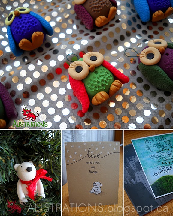

I got some business cards made at the same print-shop. I also got a few miniature art prints made in the size of business cards – I found a place that could do these for a very low price, so that I could give them away for free at the show; one of the prints featured a page from “Pigs On A Bus,” and it was definitely the most popular print! Lastly, I had a little candy jar with some Starbursts!


I also wanted to share a meaningful bible verse at my booth. I found one that really defined my journey to starting my own business, and really my journey through life as well. I bought a little chalkboard from a craft store and wrote the verse on it using a white multi-surface pencil. (I made sure to test the pencil first to make sure that it could be erased, and it's a good thing, too! Because – and this is so funny – it took me SO MANY tries to get the word “patient” just right!)


Practising my set-up at home really helped speed up the process once I got to my church – even though my booth ended up being at a round table, which I had not anticipated (I only had to slightly rearrange my things). Here's what my final booth looked like:


I have some very talented friends at my church who also displayed their art, and who are planning on opening Etsy shops in the near future! When they do, I will be sure to post about it! (And in case you were wondering, I am planning on opening an Etsy shop, too! I have got a few ideas of things I want to sell, but if any of you have any suggestions, I would be happy to hear them!)

Have any of you ever displayed anything at a show? Feel free to leave a comment and share about your experience! :)


Alison

Tuesday 29 July 2014

INTRODUCING BUCKY & FRANK

All throughout my childhood, I loved comic strips. I loved reading them in the Sunday paper, and I loved creating my own comics, too. I came up with so many different ideas, but I only ever stuck with one idea for a few strips until I moved on to something new. Then one day, when I was 13, I invented a new comic strip that stuck – and it lasted right up until just before I went to college! It was about a beaver named Bucky and a frog named Frank, and all the mischief they could get themselves into. And I thought it would be fun to share some of these old comics with you!


Below is one of the first drawings of Bucky & Frank that I ever did. (They looked a bit different at the beginning – they developed a cleaner look and they even developed unique personalities as I started drawing them more regularly!)


My original idea for this comic was that they would be software developers who had no skills and therefore could not keep a job. My sole inspiration for that aspect of my comic was that my dad is a software developer – but since I actually didn't know anything about that field, that idea didn't last too long. Below is one of the first actual comic strips that I created with these characters:


My storyline shifted to the characters struggling to keep any job at all. Then after that, it shifted again and became about two characters who just didn't have a lot of money, and who came up with crazy ways to overcome this unfortunate circumstance. What usually ended up happening was that Frank was always trying to talk Bucky out of his ridiculous schemes – such as building a car using parts of the house. Here are two more comic strips:


I hope you found my silly beaver and frog amusing, and I will certainly be including more of them in future posts!


Alison


P.S. My new wedding stationery website, Limes & Daisies, is still in progress! I will let you all know when it is close to being officially launched!

Tuesday 8 July 2014

SORRY IT'S BEEN SO LONG

Hello everyone!

I really wanted to post something a lot sooner, so first let me apologize for the extremely long delay. Allow me to fill you in on what I have been up to lately...

First, I have exciting news regarding Pigs On A Bus! I mentioned in my last post that my boyfriend, Jonathan, and I were looking into having it published. Well, guess what? It's actually going to happen! It is currently in the publishing process, and I anticipate that it will be in print before the end of the year!

To celebrate, I am sharing just a few more pages of the story with you! (If you missed the first part, you can see it here). [Disclaimer: our story had to be slightly edited for publishing, and a few pages had to be cut – so the published version won't appear EXACTLY as shown on this blog.]


My second piece of news is applicable to anyone who likes guitars – or sheep. A friend of mine, James, sells guitar pedals, and he decided that some of them needed illustrating! He asked me to design a “Sheep in Sheep's Clothing” for his transparent overdrive pedal. Here's the drawing:


(The pedal is still in the works, but once I get a photo of the finished product, I will be sure to share it with you!)

You can find out more about James and his guitar accoutrements (is that a great word, or what?) by visiting:

Last, but most certainly not least, I have been busily working on a big new project that I am so excited to share with you!! You may have noticed that I have posted a couple of my new wedding stationery designs on my website and on Pinterest. Well, not only am I still making more designs... but I am also creating a whole new website entirely devoted to weddings! I love weddings, and designing stationery is heaps of fun!


Through my new site, Limes & Daisies, you will be able to choose from (and modify) any of my existing invitation designs, or have one completely custom-designed from scratch! And I am including custom cake toppers in the mix as well!

Here's just a few of my designs so far:


Well, that's all for now! And this time, I fully intend to post something sooner than a few months down the road!


Alison

P.S. I hope to have the new wedding site up and running very soon! In the meantime, however, please don't hesitate to contact me if you know anyone who needs wedding stationery or a cake topper! They can email me at alistrations@gmail.com and I will quite happily create something special for them. (Or for you, too!)


:)

Tuesday 22 April 2014

PIGS ON A BUS

My boyfriend, Jon, has a wonderful sense of humour. Sometimes he will just start making up silly, ridiculous stories and things to make people laugh. Pigs On A Bus is one of these stories. I like to tell people that he accidentally wrote it, because he was just being himself and making me laugh, and ended up creating something that I knew would make a marvelous children's book.

I just recently illustrated Jon's story. I laminated the originals (drawn traditionally on white cardstock and coloured mostly with Faber-Castell Polychromos coloured pencils) and bound them into a little home-made book as a birthday gift for him. He was extremely pleased and has allowed me to share it with you on my blog. In fact, we are even looking into having it published! I will keep you posted on that. For now, here's a sneak preview of Pigs On A Bus...


...And the adventure continues from there! What do you think so far?


Alison

P.S. If you have written a story and are in need of an illustrator, please email me at alistrations@gmail.com and I would be happy to provide you with a quote! You will find more information on my official website www.alistrations.webs.com.

Friday 28 February 2014

WATERCOLOUR EXPERIMENT

I recently completed a project for one of my close friends. She asked me to create some typography art she could frame (as a gift for another friend) – a Bible verse with a watercolour background.

She had a couple different verses in mind as options, and a general idea of what the background might look like. So, I used Photoshop to come up with a few visuals to help her decide what she liked best. These two are my favourites:


My friend ended up liking that second one best as well, with just a few modifications. :)

Now it was on to the real thing. CONFESSION: I am not an expert in watercolours! (They are actually not listed on my website as an “available medium.”) But, I decided to give it a go anyway. It took me three tries, but I was able to create one that she loved! Below are what all three attempts look like:


If you are a watercolour novice as well, I hope you will be able to benefit from some of the things I discovered. Please read on... :)

My first background ended up looking fine, but there were two problems: First, the purple was much too pink. (One of the modifications my friend requested was that the purple have more navy in it.) The purple I mixed up on my pallette looked great, but it ended up looking quite different when I got it on the paper. Even testing out my colour on a scrap of the same kind of paper did not help much – I guess because a few quick brushstrokes makes the colour come out darker than when I spread it across the whole entire paper. The second problem was that it ended up being much to dark. I knew that black lettering would not stand out at all.


For my second attempt, I added more water to the paint to make it thinner. This made the colours lighter, but I soon realized that I needed to let each layer dry before adding more paint on top! I started by putting a thin layer of purple paint over the whole paper. I wanted to add more layers over most of the paper, but leave the bottom with a more faded look. When I kept adding more paint where I wanted it to be darker – while the layers underneath were still wet – it hardly made a difference. However, if I accidentally painted over where I wanted it to stay light – where the layer underneath had already dried – it actually went way darker! There was one point where I thought I had sort of ruined it, but it ended up turning out in the end. :)

For my third attempt, I pulled out the trusty hair blow-dryer and actually dried each layer before I added any more paint. This helped me control things more, and I love the “ridged” look the blow-dryer gave it! This background ended up being my favourite.

Guess which one my friend liked best? Option 2!! Now all that was left was to add the lettering. I love typography, so this was no problem. She wanted the letters to be very simple and neat. Here's how it turned out:


She loved it! It was exactly how she pictured it – I was so glad!

One more note for those who are non-watercolour experts, like me: even though I used super-thick watercolour paper, it still buckled a lot when it was wet. Don't worry if this happens to you! It should flatten out by the time it is dry. Even if it doesn't flatten out all the way at that point, just put something a bit heavy on top (I used my watercolour sketch pad), and everything should be fine. :)

Have any of you had any adventures with mediums you weren't familiar with? Please feel free to share them!


Alison

Monday 24 February 2014

HELLO!

Hello everyone!

My name is Alison, and I have just recently started freelancing as a visual artist! My blog is for anyone who loves art – whether you love to look at it, collect it, commission it, or create it!

I will be sharing about my latest projects, things I am selling, techniques I have learned, ideas for things to sketch (I welcome your input, too :) - and more! Please feel free to tell me about your own art experiences as well. I hope we can inspire each other!

I realise that this is a fairly short post, but it's just the start. :) Be sure to check back again soon for my next post! For now, I will leave you with a little collage to give you an idea of the kind of art that I create...


Alison